Every Premier League 2022/23 home kit – ranked
Another Premier League season is on the horizon and that means we at 90min towers have a new set of kits to critique.
As my good friend Homer Simpson once said, it’s not just easy to criticise – it’s fun, too.
Who’s drowning in sauce and who’s drowning their sorrows? Who’s heading to the club shop and who’s heading to the club? Which kits are dripping and which are we dropping?
Ok, I’m out of puns. Let’s get into it.

Positives: It’s an official piece of Brighton & Hove Albion merchandise
Negatives: It probably shouldn’t be
It was all going so well, Brighton. And then the yellow was added.

Positives: Hummel are thinking outside the box
Negatives: They should no longer think outside the box
Southampton have had some daring throwback designs in recent years. This is not their best work.
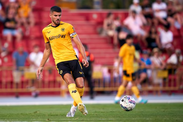
Positives: The brighter the amber the better
Negatives: It looks like it’s going to rip at any moment
The design on Wolves‘ home kit is fairly safe and that’s fine. The amount of sweat seeping through and flimsy material it looks to be made of? Big no-no.

Positives: Eric Cantona-inspired collar
Negatives: Man Utd will do anything to relive the glory days, huh?
This is Manchester United Football Club (and their home kit) we are talking about here. And it stinks. The patterns on the shirt and collar are hideous.

Positives: Hard to get Villa’s claret and blue scheme wrong
Negatives: Doesn’t seem like that was for the want of trying
Another kit treading the fine line between simple and boring. I’m leaning slightly towards the latter.

Positives: Could be a classic
Negatives: Could be the same Leeds kit as every other for the last 30 years
The white looks crisp, the blend of blue and yellow works well. So…why does it only add to my belief that Leeds are going to have a terrible season?

Positives: Unique collar pattern
Negatives: A quick Google search will probably reveal it’s not unique
Like with Leeds, adidas always give Fulham some trendy designs. But until they can prove that they’re not Norwich City playing in white, that means very little, I’m afraid.

Positives: Gorgeous shade of red
Negatives: It is literally only that red for 99% of the kit
Feeling daring, were we, Nike?
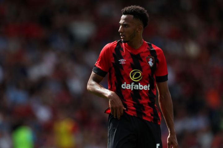
Positives: Imaginative use of stripe pattern
Negatives: Almost definitely being known as the kit Bournemouth finished 20th in
After at first being repulsed by Bournemouth’s black and red stripes, it’s hard to actually be too offended by Umbro’s design.

Positives: Big Harry Hill collar
Negatives: If anything it’s not big enough
Listen, Leicester, if you’re going to try and go retro, at least go all in. Why isn’t that collar down to the chest?
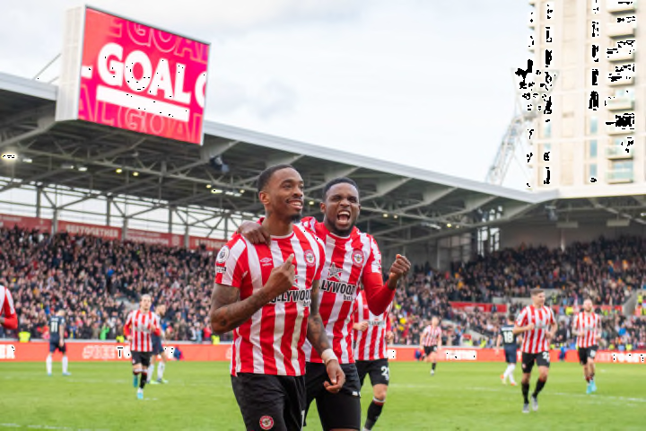
Positives: Helping fans save money
Negatives: Just a bit dull, init
Brentford made a pledge towards the end of 2021 that they would carry their home kit into the next season. A fine commitment but one that isn’t creative, so they get the midtable spot.

Positives: Neat little details based on Prince Rupert’s Tower
Negatives: Why am I supposed to care about that?
Finally, an Everton kit without a hideously ugly shade of yellow to ruin it.

Positives: That’s how you keep a striped-design clean
Negatives: Castore tax
Not a huge fan of sky blue becoming a regular thing on Newcastle home kits, but this is as good as it’s going to look with it and it’s still superb.

Positives: Timelessly simple yet effective
Negatives: This writer’s prejudices
A lot of people have been blown away by Chelsea’s home kit for the new season. Personally not as fussed, but hey, it’s still pretty good. A nice lil Europa Conference League place for you, Nike.

Positives: A cracking modern take on a classic
Negatives: This writer’s biases
When Spurs‘ new home kit was leaked earlier this year, I considered sitting outside Hotspur Way with a sign which read ‚NO TO NEON YELLOW‘. But the design has since grown on me, which is good because Hotspur Way is miles out from civilisation.

Positives: Puma finally made a great kit
Negatives: There has to be a catch
Bringing back the burgundy trim and going for a central logo? May as well sign the Gallagher brothers up for the new season if you’re feeling this 1990s, Man City.

Positives: No sponsor is a big win
Negatives: It might be one of Forest’s only wins this season, eh!!!!
Heads up Forest, adding an ugly shirt sponsor will see you moved down about 11 places.

Positives: adidas and Arsenal are undefeated in this business
Negatives: It’s a shame that on-field performances haven’t matched in recent years
This might be the most Arsenal kit that Arsenal have ever had. They’re not pedalling Man Utd’s collar-up rubbish, either.
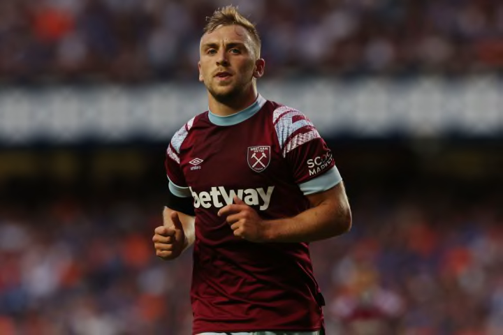
Positives: Best claret and blue kit of all time
Negatives: It’s still claret and blue
Hello, West Ham’s club shop? 90min’s Toby Cudworth would like to place a bulk order for these beauties.
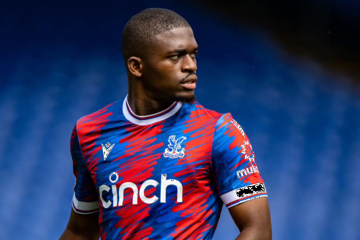
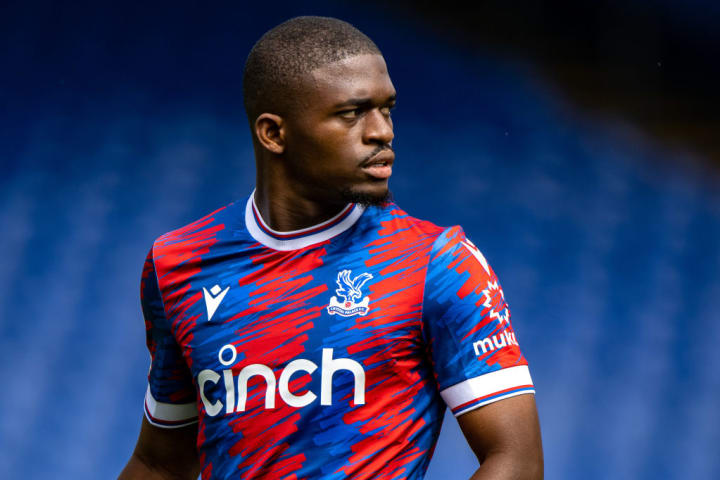
Positives: If I were a Palace fan I would buy eight of these
Negatives: You’re not getting my money, Steve Parish
If we were ranking all kits in general this season, then Palace’s three for the upcoming campaign would rank first, second and third. Macron have come up with some legendary designs for the Eagles befitting of a proper ’streets won’t forget‘ team.