The worst football club crest changes ever
Tradition is one of the key pillars that links football clubs and their fans, so when things change people can get a bit angsty…
Clubs have figured that out in the past that the best way to avoid the drama is to consult fans first and put out feelers before doing anything too different.
Changing the club crest is one of those moves that should be approached with extreme caution. Here are the worst club crest changes in recent years – ranked.
I M FC Internazionale Milano.
What I M comes from what I have always been.
I M open to the whole world and rooted in one city. #IMInter pic.twitter.com/iQVzmyrE3u— Inter (@Inter_en) March 30, 2021
Inter announced the end of an era when it was revealed that their long-term shirt sponsorship deal with Pirelli was to end after 26 years.
They followed that up with a crest change too and, while the brand makeover certainly not the worst on the list, reaction to it hasn’t been great in Italy’s fashion capital…
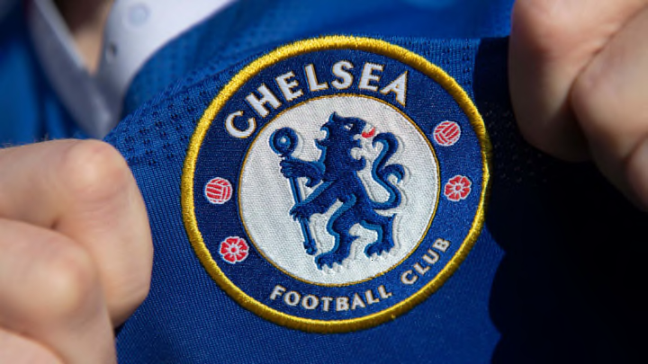
When Roman Abramovich took over the club in 2003 he set about changing Chelsea from top to bottom. Not only did he inject truckloads of cash into the team but he ordered the redesign of the club crest too.
He kept the roaring lion and the traditional blue and yellow colours, but the crest was entirely modernised.
While it’s now widely accepted, at the time it was met with dissent from fans with worries that Abramovich was wiping the history of the club. Not sure many would complain now though…
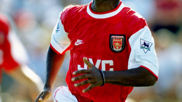
The Gunners replaced their club crest, which had adorned shirts in some form since the 1940s, for the modern iteration in 2002, ahead of the move to the new Emirates Stadium.
While the new design was a little dull in comparison with the much-busier original (and the cannon was now facing the other way), It was the fact that the change was made without any fan consultation that really irked the fans.
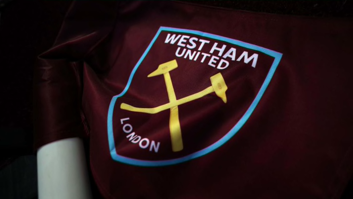
When the Hammers moved to the London Stadium back in 2016, West Ham fans voted in favour of changing the club crest to something more modern.
More modern ultimately meant ‚minimal‘.
The sledgehammers stayed put but that was about it from the old design, with the name of the club and ‚London‘ written below.
How boring.
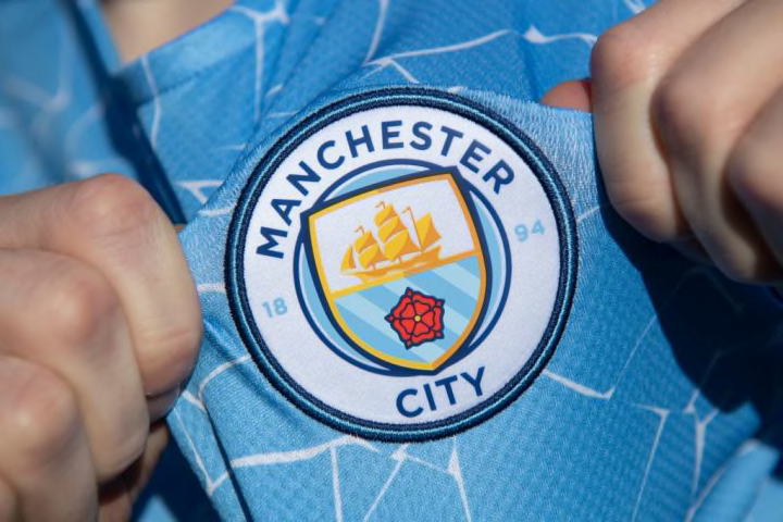
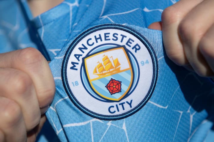
Man City’s Abu Dhabi owners went for a brand re-do in 2015, but tried to avoid the mistakes of Arsenal by canvassing fans for their opinions.
The new circular design ditched the latin motto and bird emblem, which were frankly just cool things.
However, rather than any specific design elements, it was the omission of the words ‚Football Club‘ which worried fans, who saw the new crest as a symbol of an inevitable slide into some sort of corporate franchise hell.
Nouveau logo, les détails du changement ? pic.twitter.com/UdhdD2rfiT
— FC Nantes (@FCNantes) May 23, 2019
There’s minimalism and then there’s the new Nantes crest.
The old version had a star for each league title the club had won, its founding date, a ship to represent the harbour and five Breton hermines.
The new version had some diagonal lines to make up an ‚N‘ for Nantes, just one Breton hermine and the club colours.
Who needs tradition anyway?
Are Everton trying to change the clubs crest?
What do you think? pic.twitter.com/SnYKqNPtYe— Webby-p (@Webby_p) April 20, 2013
After years of battling to get into the elite of England’s football teams, Everton made a brand change decision in 2013 and switched up their crest.
The club mantra „Nil Satis Nisi Optimum“ disappeared along with a new shade of blue and the fans absolutely hated it.
Due to the reaction from fans, the new look only lasted a year before being redesigned once more to include the missing elements.
Bullet dodged.
Cardiff City – chairman thinks that red is lucky and puts in red seats and sticks a red Welsh Dragon as their crest for ‚The Bluebirds‘. pic.twitter.com/LvG4cTJV7u
— Craig Jones (Stuck @ ?)? (@Craig_J_85) January 24, 2018
One of the most notorious crimes in the history of football rebranding.
Back in the early teens, Cardiff City were taken over by Vincent Tan who had an entirely new vision for the club.
Not only did he change the club’s colours from blue to red, but he completely changed the crest, with the bluebird replaced by a red Welsh dragon. Fans rioted, the media were disgusted and Tan was forced to undo his changes… at least he did after three years of staying steadfastly stubborn.
As of writing they are known as the ‚Bluebirds‘ once more and wear a blue home kit with a new crest that has ‚united the club‘, but Tan is still the owner so anything’s possible…
6 months of research
10,000 people consulted
Ready for the next 100 yearsWatch video ➡️ https://t.co/rIIdL2Yz9F pic.twitter.com/pMrd3zTjCl
— Leeds United (@LUFC) January 24, 2018
Remember when you were a kid and you played the ‚Master League‘ on Pro Evolution Soccer and got to make your own club? That’s basically what Leeds United’s designers did in 2018.
To mark the centenary year of the club, they unveiled a new crest that featured a video-game like character pounding his chest with the words ‚Leeds United‘ emblazoned above it. No tradition whatsoever.
Fans went (understandably) mental, memes were spawned and the design was scrapped within days of it being unveiled, before the club opted to go with something far more familiar.
What are peoples thoughts on the new Juventus crest? pic.twitter.com/KhqbiUC81f
— Kickabout (@kickabout_app) January 19, 2017
Juventus are one of the biggest and best football clubs in the world. They are often lauded for their traditional values while their old crest was one of the best known and loved around.
So in 2017 when they announced a rebrand, there was shock and laughter at what this great club had managed to come up with… The word ‚Juventus‘ above a ‚J‘ being spooned by a bigger ‚J‘.
That was it. That was the whole crest.
Despite the backlash it received, Juve stuck by their marketing bods and the new crest remains to this day.